RangeInput creates a numeric range slider UI component with input fields. It works in the same way as RangeSlider.
Example uses:
- filtering products from a price range in an e-commerce shopping experience.
- filtering flights from a range of departure and arrival times.
Usage
Basic Usage
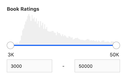
<RangeInput
	componentId="RangeInputComponent"
	dataField="rating"
	title="Ratings"
	range={{
		start: 3000,
		end: 50000,
	}}
/>
RangeInput provides all the props supported by RangeSlider.
Usage With All Props
<RangeInput
    componentId="RangeInputSensor"
    dataField="rating"
    title="Ratings"
    range={{
    	start: 3000,
    	end: 50000,
    }}
    defaultValue={{
    	start: 4000,
    	end: 10000,
    }}
    rangeLabels={{
    	start: 'Start',
    	end: 'End',
    }}
    showFilter={true}
    stepValue={1}
    showHistogram={true}
    interval={2}
    react={{
    	and: ['CategoryFilter', 'SearchFilter'],
    }}
    URLParams={false}
    includeNullValues
    endpoint={{
      url:"https://appbase-demo-ansible-abxiydt-arc.searchbase.io/recipes-demo/_reactivesearch.v3", //mandatory
      headers:{
        // relevant headers
      },
      method: 'POST'
    }}
/>
Props
componentId
| Type | Optional |
|---|---|
String |
No |
unique identifier of the component, can be referenced in other components' react prop.
endpoint
| Type | Optional |
|---|---|
Object |
No |
endpoint prop provides the ability to query a user-defined backend service for this component, overriding the data endpoint configured in the ReactiveBase component. Accepts the following properties:
- url
String[Required] URL where the data cluster is hosted. - headers
Object[optional]
set custom headers to be sent with each server request as key/value pairs. - method
String[optional]
set method of the API request. - body
Object[optional]
request body of the API request. When body isn't set and method is POST, the request body is set based on the component's configured props.
- Overrides the endpoint property defined in ReactiveBase.
- If required, use
transformResponseprop to transform response in component-consumable format.
- Overrides the endpoint property defined in ReactiveBase.
- If required, use
transformResponseprop to transform response in component-consumable format.
- dataField
String
DB data field to be mapped with the component's UI view. The selected range creates a database query on this field.
range
| Type | Optional |
|---|---|
Object |
Yes |
an object with start and end keys and corresponding numeric values denoting the minimum and maximum possible slider values.
range prop accepts (JavaScript) Date objects as values for the start and end keys when a date type field is used for the dataField.
    <RangeInput
        componentId="RangeInputComponent"
        dataField="timestamp"
        title="Publication year"
        range={{
            start: new Date('1980-12-12'),
            end: new Date('2000-12-12'),
        }}
        queryFormat="date"
    />
nestedField
| Type | Optional |
|---|---|
String |
Yes |
use to set the nested mapping field that allows arrays of objects to be indexed in a way that they can be queried independently of each other. Applicable only when dataField is a part of nested type.
title
| Type | Optional |
|---|---|
String or JSX |
Yes |
title of the component to be shown in the UI.
defaultValue
| Type | Optional |
|---|---|
Object |
Yes |
selects a initial range values using start and end key values from one of the data elements.
value
| Type | Optional |
|---|---|
Object |
Yes |
controls the current value of the component.It selects the data from the range (on mount and on update). Use this prop in conjunction with onChange function.
onChange
| Type | Optional |
|---|---|
function |
Yes |
is a callback function which accepts component's current value as a parameter. It is called when you are using the value prop and the component's value changes. This prop is used to implement the controlled component behavior.
validateRange
| Type | Optional |
|---|---|
function |
Yes |
is a callback function that can be used to validate the range input values before applying it. This function accepts an array of numbers where first element represents the start range and second element represents the end range. The following example prevents the users to type negative value for start range input.
<RangeInput
    validateRange={[start, end] => {
        if(start < 0) {
            return false
        }
        return end
    }}
/>
rangeLabels
| Type | Optional |
|---|---|
Object |
Yes |
an object with start and end keys and corresponding String labels to show labels near the ends of the RangeInput component.
showFilter
| Type | Optional |
|---|---|
Boolean |
Yes |
show the selected item as a filter in the selected filters view. Defaults to true.
snap
| Type | Optional |
|---|---|
Boolean |
Yes |
makes the slider snap on to points depending on the stepValue when the slider is released. Defaults to true. When set to false, stepValue is ignored.
stepValue
| Type | Optional |
|---|---|
Number |
Yes |
step value specifies the slider stepper. Value should be an integer greater than or equal to 1 and less than Math.floor((range.end - range.start) / 2). Defaults to 1.
showHistogram
| Type | Optional |
|---|---|
Boolean |
Yes |
whether to display the range histogram or not. Defaults to true.
interval
| Type | Optional |
|---|---|
Number |
Yes |
set the histogram bar interval, applicable when showHistogram is true. Defaults to Math.ceil((props.range.end - props.range.start) / 100) || 1.
URLParams
| Type | Optional |
|---|---|
Boolean |
Yes |
enable creating a URL query string parameter based on the selected value of the list. This is useful for sharing URLs with the component state. Defaults to false.
includeNullValues
| Type | Optional |
|---|---|
Boolean |
Yes |
If you have sparse data or document or items not having the value in the specified field or mapping, then this prop enables you to show that data. Defaults to false.
queryFormat
| Type | Optional |
|---|---|
String |
Yes |
Pass the queryFormat prop when dealing with date-type fields. Defaults to date. It sets the date format to be used in the query, can accept one of the following:
queryFormat |
Representation as elasticsearch date</p |
|---|---|
epoch_millis (default) |
epoch_millis |
epoch_second |
epoch_second |
basic_time |
HHmmss.SSSZ |
basic_time_no_millis |
HHmmssZ |
date |
yyyy-MM-dd |
basic_date |
yyyyMMdd |
basic_date_time |
yyyyMMdd'T'HHmmss.SSSZ |
basic_date_time_no_millis |
yyyyMMdd'T'HHmmssZ |
date_time_no_millis |
yyyy-MM-dd'T'HH:mm:ssZZ |
Note:
queryFormatis mandatory to pass when dealing with date types.
calendarInterval
| Type | Optional |
|---|---|
String |
Yes |
It sets the interval for aggreation-data when dealing with date-types. Default value is calculated internally based on the range - start and end values. It can accept one of the following: year, quarter, month, week, day, hour, and minute.
Demo
Styles
RangeInput component supports innerClass prop with the following keys:
slider-containerinput-container
The other innerClass properties are the same as supported by RangeSlider.
Extending
RangeInput component can be extended to
- customize the look and feel with
className,style, - update the underlying DB query with
customQuery, - connect with external interfaces using
beforeValueChange,onValueChangeandonQueryChange, - filter data using a combined query context via the
reactprop.
<RangeInput
  ...
  className="custom-class"
  style={{"paddingBottom": "10px"}}
  customQuery={
    function(value, props) {
      return {
        query: {
            match: {
                data_field: "this is a test"
            }
        }
      }
    }
  }
  beforeValueChange={
    function(value) {
      // called before the value is set
      // returns a promise
      return new Promise((resolve, reject) => {
        // update state or component props
        resolve()
        // or reject()
      })
    }
  }
  onValueChange={
    function(value) {
      console.log("current value: ", value)
      // set the state
      // use the value with other js code
    }
  }
  onQueryChange={
    function(prevQuery, nextQuery) {
      // use the query with other js code
      console.log('prevQuery', prevQuery);
      console.log('nextQuery', nextQuery);
    }
  }
  react={{
    "and": ["ListSensor"]
  }}
/>
className
| Type | Optional |
|---|---|
String |
Yes |
CSS class to be injected on the component container.
style
| Type | Optional |
|---|---|
Object |
Yes |
CSS styles to be applied to the RangeInput component.
customQuery
| Type | Optional |
|---|---|
Function |
Yes |
takes value and props as parameters and returns the data query to be applied to the component, as defined in Elasticsearch Query DSL.
Note: customQuery is called on value changes in the RangeInput component as long as the component is a part of react dependency of at least one other component.
beforeValueChange
| Type | Optional |
|---|---|
Function |
Yes |
is a callback function which accepts component's future value as a parameter and returns a promise. It is called everytime before a component's value changes. The promise, if and when resolved, triggers the execution of the component's query and if rejected, kills the query execution. This method can act as a gatekeeper for query execution, since it only executes the query after the provided promise has been resolved.
Note:
If you're using Reactivesearch version >=
3.3.7,beforeValueChangecan also be defined as a synchronous function.valueis updated by default, unless you throw anErrorto reject the update. For example:
beforeValueChange = value => {
    // The update is accepted by default
    if (value.start > 3000) {
        // To reject the update, throw an error
        throw Error('Start value must be less than or equal to 3000.');
    }
};
onValueChange
| Type | Optional |
|---|---|
Function |
Yes |
is a callback function which accepts component's current value as a parameter. It is called everytime the component's value changes. This prop is handy in cases where you want to generate a side-effect on value selection. For example: You want to show a pop-up modal with the valid discount coupon code when some range is selected in a "Discounted Price" RangeInput.
onQueryChange
| Type | Optional |
|---|---|
Function |
Yes |
is a callback function which accepts component's prevQuery and nextQuery as parameters. It is called everytime the component's query changes. This prop is handy in cases where you want to generate a side-effect whenever the component's query would change.
react
| Type | Optional |
|---|---|
Object |
Yes |
specify dependent components to reactively update RangeInput's data view.
- key
Stringone ofand,or,notdefines the combining clause.- and clause implies that the results will be filtered by matches from all of the associated component states.
- or clause implies that the results will be filtered by matches from at least one of the associated component states.
- not clause implies that the results will be filtered by an inverse match of the associated component states.
- value
String or Array or ObjectStringis used for specifying a single component by itscomponentId.Arrayis used for specifying multiple components by theircomponentId.Objectis used for nesting other key clauses.
index
| Type | Optional |
|---|---|
String |
Yes |
The index prop can be used to explicitly specify an index to query against for this component. It is suitable for use-cases where you want to fetch results from more than one index in a single ReactiveSearch API request. The default value for the index is set to the app prop defined in the ReactiveBase component.
Examples
See more stories for RangeInput on playground.


